At VisualCue, we’re pretty focused on data visualization. Makes sense- our entire enterprise is built around the premise that just by looking at data in a new way you can make better decisions and improve whatever you do.
But there’s something that we don’t perhaps talk about as often as we should- and that’s the data living behind that visualization. According to his blog on October 8th, Vice President and Research Director at Ventana Research Tony Cosentino states “To be able to make the best decisions, organizations need access to multiple integrated data sources.”
We couldn’t agree more.
To make it clearer, let’s take a look at a VisualCue Tile, shall we?
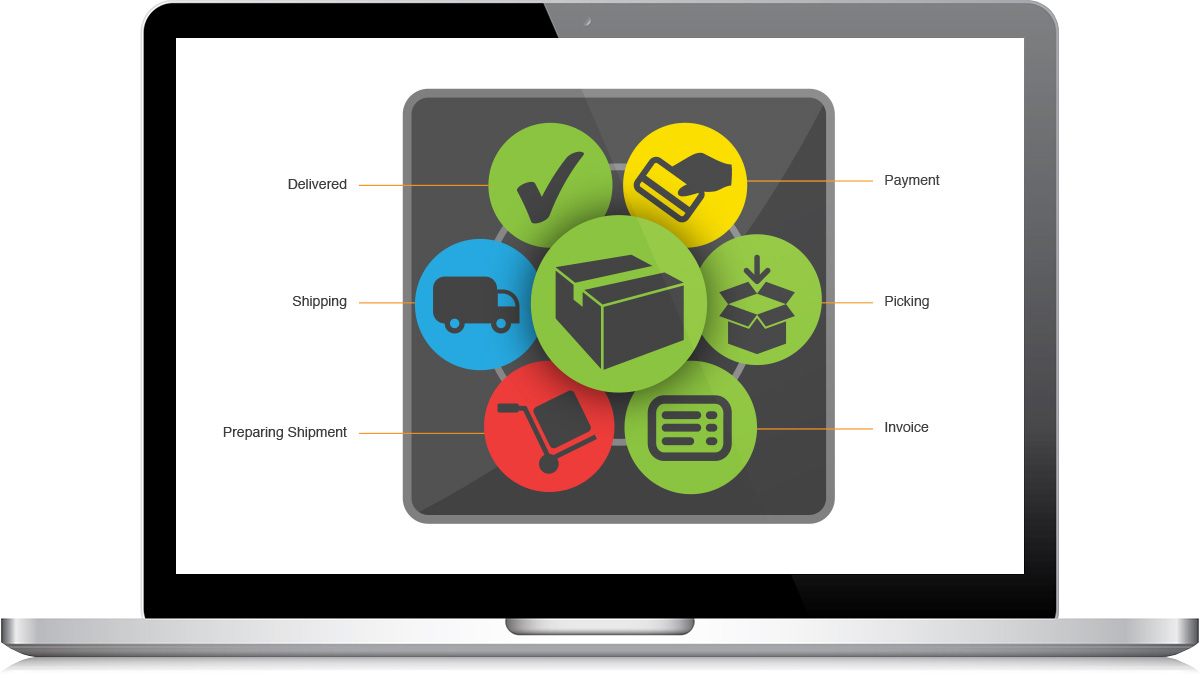
This Tile shows six different steps in a shipping process. Each of the steps needs to be completed in good time so the order, represented by the large cue in the center, can be green. In the case of this particular Tile each of these steps needs to be completed for every order received, so depending on the size of the organization we could have hundreds or thousands of orders a day, each with six steps that need to be completed on time.
You can easily look at the Tile above and see that the Payment and Prepare Shipment steps took longer than management’s best practices expectations the overall order got out on time. But what about the data that went into preparing that Tile?
Each of those six steps could, with VisualCue, come from a different report or data source. Data regarding payments could be gathered in one spreadsheet while the invoices are automatically populated into database. With VisualCue you can gather all of these disparate, scattered reports and see them in one, intuitive visualization you can immediately understand to make better decisions faster.
It would appear that gathering data for cloud analytics is a great idea. According to Cosentino, “…integrating data for cloud analytics can give organizations competitive advantage.” A VisualCue Tile is precisely that- it gathers data and presents it in such a way that makes analytics fast and easy so you can gain a competitive advantage.
But how does one go about gathering disparate reports? Cosentino goes on to state that 58% of those businesses using spreadsheets to prepare data for visualization said it “hampers their ability to manage processes efficiently” and that “organization using newer integration tools are satisfied with them more often than those using older tools.”
In that spirit, VisualCue partners with Pentaho, a leading data integration and business analytics organization. Their open-source platform is at the forefront of modern data integration technology, making it fast and easy to gather data from wherever it lives and prepare it for intuitive VisualCue analysis.
Data integration tying together multiple data sources working hand-in-hand with cloud-based analytics software might sound like a daunting task to some, but we’ve been hard at work to make not only cloud-based data analysis intuitive, but preparing your data as well. We like to think that we’re included when Cosentino notes that “such complexity is the new reality, and new tools and approaches have come to market to address these complexities.”
Until next time,
The VisualCrew