We’ve written a lot about the amazing human visual system, and what a shame it is that we don’t use it more often in data visualizations.
But frankly that is just one small (albeit awe-inspiring) part of the amazing, interconnected system that is your body.
When you think about it, your body is the ultimate source of streaming data. It is constantly providing you with feedback: it tells you when it’s hungry, thirsty, tired, cold, hot or doing just fine. This data is streaming from dozens of different sources and is processed and analyzed by the best data analytics processor in the business: your own mind.
Today we’re looking at different, innovative ways that clever people out there have come up with to visualize the data that’s coming from your own body… probably right now.
The Making of Me and You
Our first data visualization comes to us from the amazing minds at the BBC, who have come up with an amazingly innovative way to wrap your head around just what is going on inside your body.
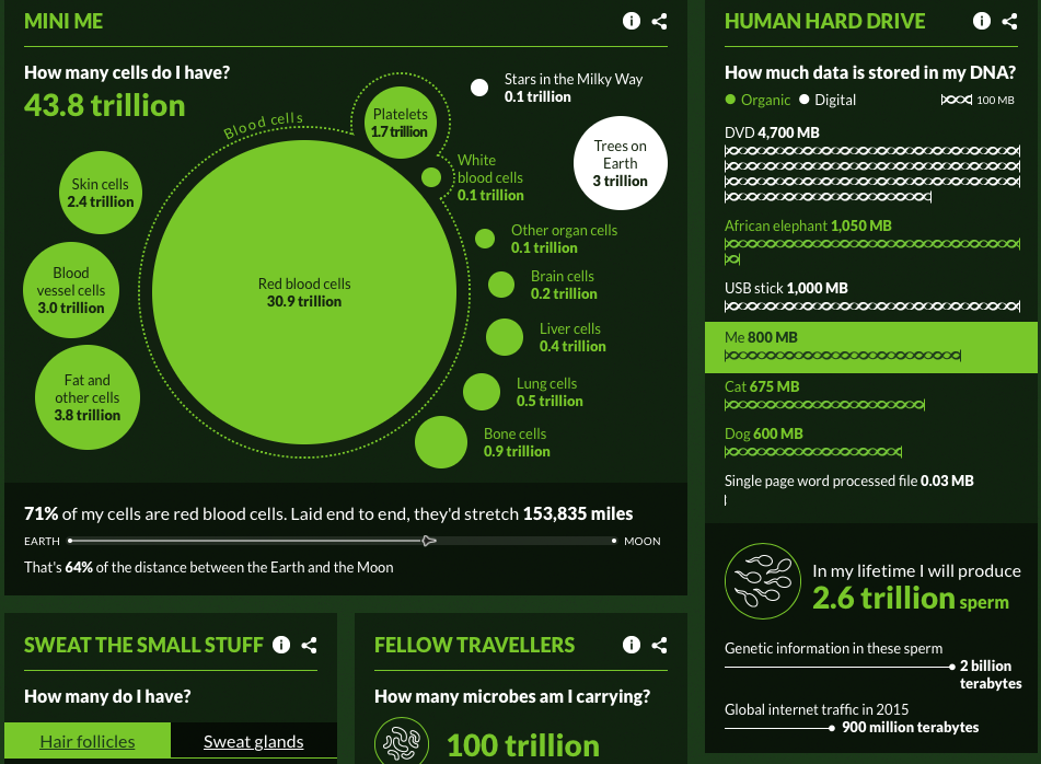
The visualization begins when you input some basic information about yourself- age, sex, weight and height. From there the visualization spills out with tons of information: some of it generalized, some of it specific. And when we say specific we mean really specific: like how many hair follicles you have or how many times (roughly) you blink in a minute.
There are also some new bits of information that you would never have thought about before exploring the visualization: like how many matches could the
Our favorite part of this visualization is the intuitive way that the BBC crew breaks up immense data sets into equivalent sizes to give you a rough comparison. Often times large sets of numbers can lose all sense of reality- they become abstracted to the point of meaningless. Tell me I have 30 trillion red blood cells and 3 trillion blood vessel cells and that all sounds like a lot. But show me a comparative picture and the whole picture becomes more clear.
We’re More than Just Numbers
The amount of red blood cells you have produced, or the amount of matchsticks that could be made with the phosphorous in your body (mine could make 4.9 million matches) is only part of what makes you YOU. But all of those massive numbers don’t begin to encapsulate your personality or emotions: the things that make you unique.
The tricky part is how do you visualize those subjective, fleeting, relatively unquantifiable but oh-so-important things?
Finnish researchers figured out how with heat maps.
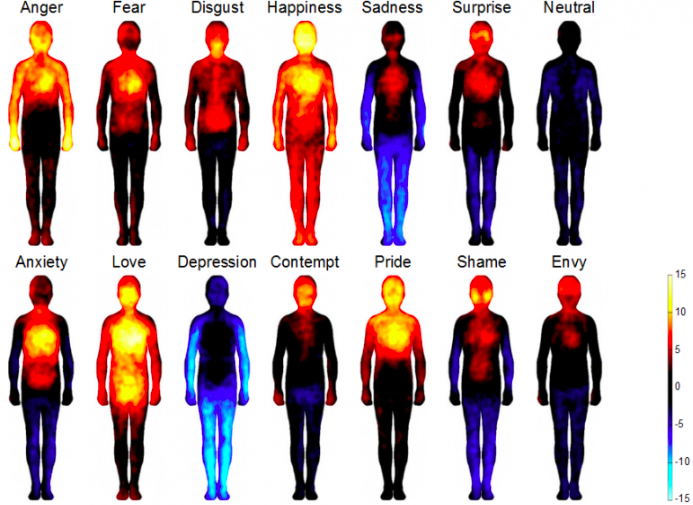
We love heat maps. It is similar to our own blue, red, yellow, green method of thresholds and data visualization but applied to other shapes and forms. We love using color to portray information because our eyes can easily make the connection between a color and a number and colors are infinitely easier to distinguish and draw patterns from.
What we love about the (literal) heat maps above is that everyone, when you look at them, can relate. From the red-cheeked feeling of shame, or the hot pit in your stomach when you feel anxious.
But more importantly we can all relate to that all-over warm feeling when you’re happy or the sudden rush from a surprise.
Either way you look at it your body is a lean, mean, data-producing machine.
Until next time,
The VisualCrew