As we look around the VisualCue offices here in Orlando, Florida on the day before Thanksgiving you can definitely tell everyone is getting ready for the holiday. The foodstuffs are being prepared and the plane tickets have been bought.
All of this holiday planning has definitely put us in the mood to celebrate- and how does VisualCue celebrate anything?
With data visualizations, of course! Those beautiful combinations of art and science that give us special insight into just about anything we would want to research. In the end we just love learning new things, and data visualization is the fastest way to do that.
This year, we’ve found different visualizations from around the Internet to help you make the most out of your holiday in three easy steps!
Step 1. Get to where you’re going
The first thing to decide when planning the perfect holiday weekend is where you are going to spend it. On that note, Thanksgiving is one of the busiest travel days of the entire year so odds are you’ve already planned it out.
If you have, or even if you haven’t, the brilliant minds over at Upshot put together this amazing interactive visualization showing the flight patterns around the Thanksgiving holiday.
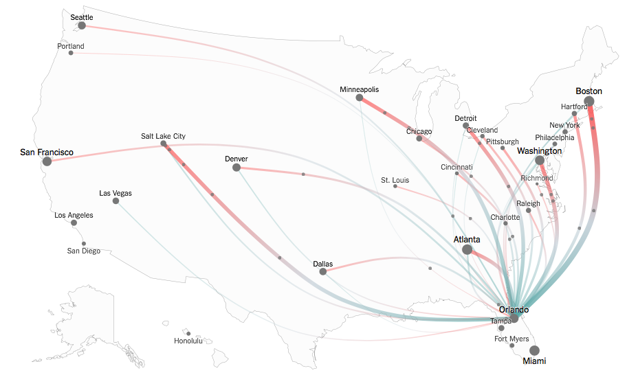
There are a few things we love about this visualization right away. First, it’s a map with easy to understand colors and that speaks to our visualization philosophy.
Second, we love how interactive it is! Just hover over a city and see the flight patterns coming into and going out of just that one place.
When we explored this visualization a little bit further we discovered that our home town of Orlando, FL can expect a huge number of visitors this year, second only to Miami.
If you’re coming in to our neck of the woods, enjoy it! We highly recommend Yellow Dog Eats for a day-after-Thanksgiving meal.
Step 2. Now that you’re there, what do you do?
So you’ve reached your destination and are ready to celebrate with your friends and family. But what do you actually do?
The brilliant minds at Sodahead bring us this next visualization where over 1,000 people were surveyed and asked about their favorite part of the Thanksgiving holiday. Their results were then put together in this stunning infographic.

Looking at the data, we discovered a heartwarming truth. Of all the people surveyed, both men and women, everyone said that spending time with family and eating were their favorite activities.
We thought that was a great theme for the data to show: enjoying a meal with your family can be a great experience that many call their favorite part of the holiday.
Step 3. What to do next?
The turkey has been eaten, the pie devoured, the belts loosened and the naps taken. What do you do next?
If you are like most Americans you get an early start on your holiday shopping, and that means braving the crowds to get a Black Friday deal.
To help you get the most out of the nation’s busiest shopping day of the year, the creative team at JESS3 put together a great series of visualizations.
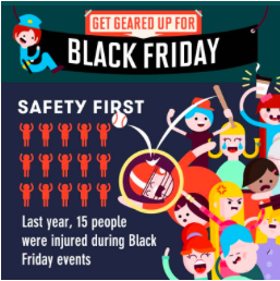
We went and checked out their Black Friday visualizations and were both amused and concerned at what we saw. Amused at the fact that 37% of shoppers arrive at the stores at midnight, and concerned by how many injuries there are each year in Black Friday related incidents.
So we recommend heading over to their website and finding out just how crazy that day will be, and encourage everyone to stay safe out there!
No matter where you are or who you are with, we hope you have a very happy holiday!
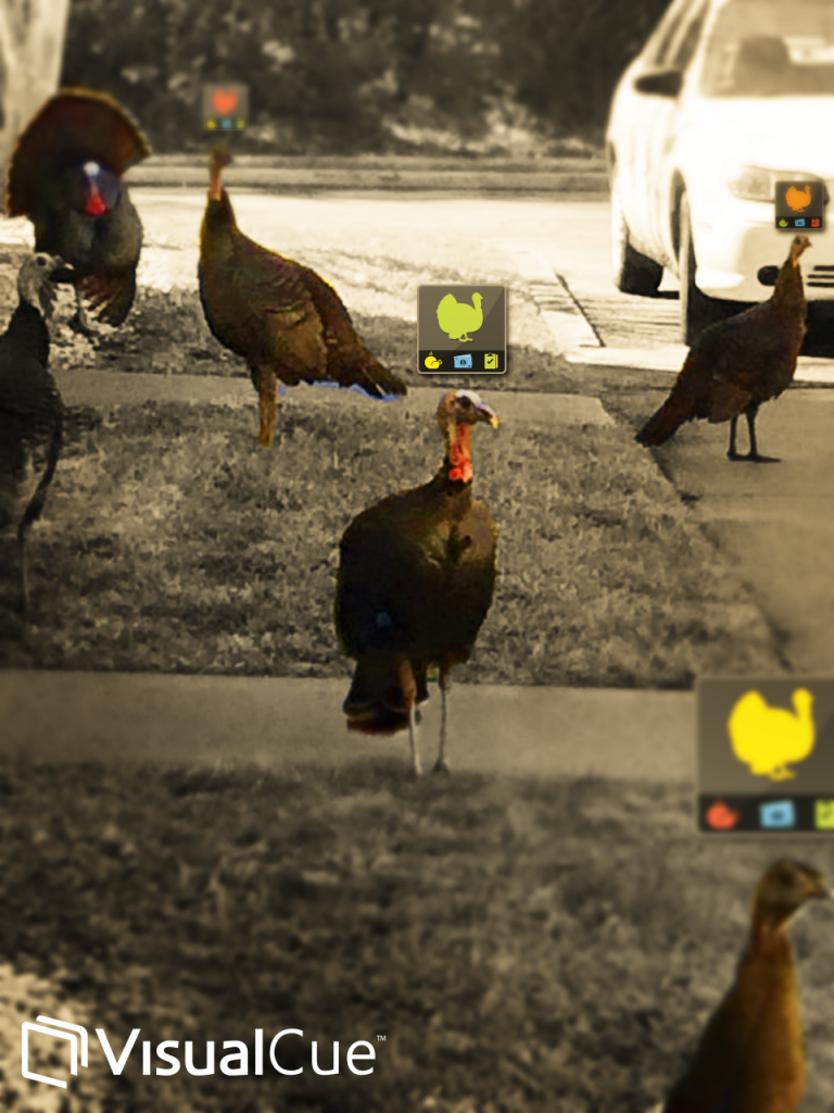
And here, enjoy our own very special data visualization for Thanksgiving- the wild turkeys that hang out in our backyard getting the VisualCue treatment.
Cheers,
The VisualCrew