At VisualCue we have a couple of specialities: industries that we have worked with time and again and have consistent success in implementing amazing data visualization solutions for them. Sales, marketing, operations and contact centers are just a few.
But one of the industries that often yields the most amazing visualizations and consistently sees the highest return on their investment into a data visualization platform is logistics: the business of moving people and material from one place to another. We have implemented data visualization solutions in dozens of logistics companies around the world.
So believe us when we say that whenever someone moves, whether it’s themselves or a physical asset, there is a lot of data generated. And where there’s data, there’s cool visualizations.
They’re coming to America…
That got us thinking about different ways to visualize how people have moved from one place to another. Our first visualization comes to us from metrocosm and shows, in one amazing video, how many people were immigrating to the United States over the course of history.
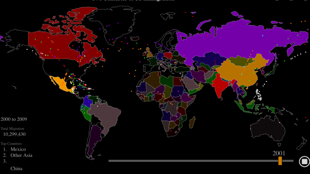
What we love about this visualization is that it takes what could have been a boring graph or spreadsheet and turns it into something that is interesting to watch, immediately understandable and even fun.
Watch the video and take a look at the drastic change in immigration that happens in the 1950s and wonder why it occurred. That’s the heart of a great visualization- it makes things clear, but it also brings up more interesting questions.
And when they’re here…
They don’t stop moving, that’s what. This visualization from Forbes is packed full of information. Just click on a county or type in a city and the map uses census data to populate how many people moved to or moved away from that location within the past few years.
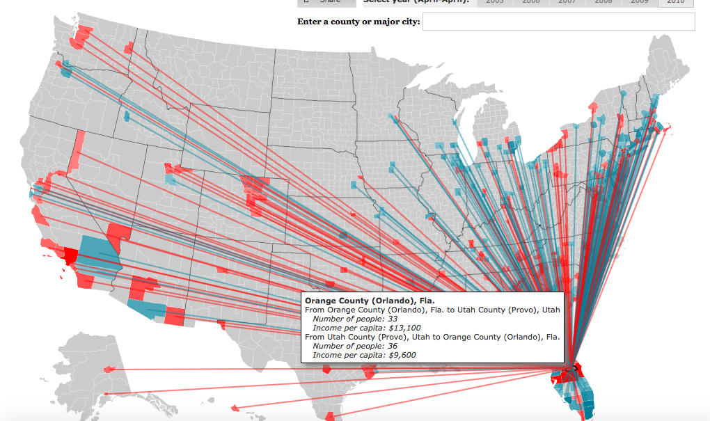
The thing that is so cool about this visualization? It once again takes what could have been a standard, boring visualization and turns it into something that you want to get lost in.
The map uses colors to tell the story: the blue lines are people coming in to the state (and where they were living before) and the red lines are people moving out of the state (and where they went instead). When you factor that in with the useful information about the destination you’ve selected built in to the visualization you once again have a visualization that answers some questions but leaves you asking more. Like which state has the highest amount of immigrants? Of emigrants? Which county has experienced the most explosive boom in population, and where are the new ghost towns?
Both of these visualizations also shed light on important aspects of data visualization that drives what we do here at VisualCue: never settle for a boring spreadsheet, and a good visualization always gives you more questions.
Until next time,
The VisualCrew